Scientific Computing#
# Required imports for the exercises
import numpy as np
import pandas as pd
from matplotlib import pyplot as plt
Exercise 1: Creating and exploring numpy arrays#
Array initialization
Create a one-dimensional NumPy array of integers from 0 to 9 using
np.arange()Print the array and its shape
Array conversion
Convert the Python list
[10, 20, 30, 40, 50]to a NumPy array by usingnp.asarray()Print the resulting array as well as its type
Reshaping an array
Use
np.reshape()to transform the array from the first step into a two-dimensional 2x5 arrayPrint the reshaped array and verify its new shape
Arrays and lists
Have a look at the documentation and create a three dimensional array of shape
(2,2,2)which is filled with zerosHow would such a shape look in the real world? Print the array on the screen. Make sure you understand how the values displayed visually map onto the dimensions of the array
Voluntary exercise: Can you generate such a 3D array with only the
np.array()method? Hint: A three-diensional array can be seen as a list of lists of lists.
# Exercise 1

# 1. Array initialization
array = np.arange(0, 10)
print("Array from 0 to 10:", array)
print("Shape of the array:", array.shape)

# 2. Array conversion
python_list = [10, 20, 30, 40, 50]
array_from_list = np.asarray(python_list)
print("\nConverted Array:", array_from_list)
print("Type of the array:", type(array_from_list))

# 3. Array reshaping
reshaped_array = array.reshape(2, 5)
print("\nReshaped Array (2x5):")
print(reshaped_array)
print("Shape of the reshaped array:", reshaped_array.shape)

# 4. Array and lists
array_3d = np.zeros((2, 2, 2))
print("\nThree-Dimensional Array (2x2x2) filled with zeros:")
print(array_3d)

# Create a three-dimensional array as a lst of list of lists
manual_3d_array = np.array([[[0, 0], [0, 0]], [[0, 0], [0, 0]]])
print("\nThree-Dimensional Array (created manually with np.array()):")
print(manual_3d_array)
Array from 0 to 10: [0 1 2 3 4 5 6 7 8 9]
Shape of the array: (10,)

Converted Array: [10 20 30 40 50]
Type of the array: <class 'numpy.ndarray'>

Reshaped Array (2x5):
[[0 1 2 3 4]
 [5 6 7 8 9]]
Shape of the reshaped array: (2, 5)

Three-Dimensional Array (2x2x2) filled with zeros:
[[[0. 0.]
  [0. 0.]]

 [[0. 0.]
  [0. 0.]]]

Three-Dimensional Array (created manually with np.array()):
[[[0 0]
  [0 0]]

 [[0 0]
  [0 0]]]
Exercise 2: Generating arrays and basic calculations#
Random arrays
Look up the documentation of
np.random.randint()and create a 3x4 array with random integers between 1 and 100Calculate and print the sum of all the elements
Arithmetic operations
Create an array from the values [5, 10, 15, 20]
Add 5 to each element of the array
Multiply the entire array by 2 and print the result
Array statistics
Create a 1D array with values ranging from 0 to 10 using
np.linspace()with 21 evenly spaced data pointsCompute and print the mean, median, and standard deviation of the array using NumPy functions
# Exercise 2

# 1. Random array
random_array = np.random.randint(1, 100, (3, 4))
print("3x4 Random Array:")
print(random_array)

# Calculate and print the sum of all elements
sum_elements = random_array.sum()
print("\nSum of all elements:", sum_elements)

# 2. Arithmetic operations
array = np.array([5, 10, 15, 20])

# Add 5 to each element
array_plus_5 = array + 5
print("\nArray after adding 5:")
print(array_plus_5)

# Multiply the entire array by 2
array_multiplied_by_2 = array_plus_5 * 2
print("\nArray after multiplying by 2:")
print(array_multiplied_by_2)

# 3. Array statistics
array_linspace = np.linspace(0, 10, 21)
print("\n1D Array with 21 evenly spaced points between 0 and 10:")
print(array_linspace)

# Compute and print the mean, median, and standard deviation
mean_value = np.mean(array_linspace)
median_value = np.median(array_linspace)
std_deviation = np.std(array_linspace)

print("\nMean:", mean_value)
print("Median:", median_value)
print("Standard Deviation:", std_deviation)
3x4 Random Array:
[[89 50 68 12]
 [79 54 74 10]
 [98 42 45 10]]

Sum of all elements: 631

Array after adding 5:
[10 15 20 25]

Array after multiplying by 2:
[20 30 40 50]

1D Array with 21 evenly spaced points between 0 and 10:
[ 0.   0.5  1.   1.5  2.   2.5  3.   3.5  4.   4.5  5.   5.5  6.   6.5
  7.   7.5  8.   8.5  9.   9.5 10. ]

Mean: 5.0
Median: 5.0
Standard Deviation: 3.0276503540974917
Exercise 3: Indexing and slicing arrays#
Basic indexing
Create a 4x4 array of random integers between 10 and 50 using
np.random.randint()Access and print the element in the second row and third column
Slicing an array
Slice and print the first two rows and the last two columns of the array from the previous step
Conditional indexing
Create a 1D array of 10 random integers between 0 and 100
Extract all values greater than 50 and store them in a new array
Print the original array and the extracted values
# Exercise 3

# 1. Basic indexing
my_array = np.random.randint(10, 50, (4, 4))
print(my_array)

element = my_array[1, 2]
print("\nElement at second row, third column:", element)

# 2. Slicing an array
sliced_array = my_array[:2, -2:]
print("\n", sliced_array)

# 3. Conditional indexing
array_1d = np.random.randint(0, 100, 10)
print("\nOriginal 1D Array:")
print(array_1d)

values_greater_than_50 = array_1d[array_1d > 50]
print("\nValues greater than 50:")
print(values_greater_than_50)
[[28 31 40 15]
 [45 13 38 36]
 [28 32 41 44]
 [10 24 10 31]]

Element at second row, third column: 38

 [[40 15]
 [38 36]]

Original 1D Array:
[82  0 65 50 88 60 95 21 71 69]

Values greater than 50:
[82 65 88 60 95 71 69]
Exercise 4: Pandas DataFrames#
Please create a Pandas DataFrame with columns “Name”, “Age”, and “City” for 5 people and print out the first two rows.
Filter out all rows where the “Age” column is greater than 30, and calculate the average age for the remaining rows.
# Exercise 4

# 1. Create a DataFrame
data = {
    "Name": ["Alice", "Bob", "Charlie", "David", "Eve"],
    "Age": [25, 32, 29, 35, 22],
    "City": ["New York", "Los Angeles", "Chicago", "Houston", "Phoenix"]
}
df = pd.DataFrame(data)

# Print the first two rows
print(df.head(2))

# 2. Filter out rows where "Age" is greater than 30 and calculate the average age
filtered_df = df[df["Age"] <= 30]
average_age = filtered_df["Age"].mean()
print(f"\nAverage Age for rows with Age <= 30: {average_age:.2f}")
    Name  Age         City
0  Alice   25     New York
1    Bob   32  Los Angeles

Average Age for rows with Age <= 30: 25.33
Exercise 5: More DataFrames#
Load the Yeatman data from https://yeatmanlab.github.io/AFQBrowser-demo/data/subjects.csv into a
DataFrame.Print the head of the
DataFrameto get an overview of what is in there.Add a filter column for people younger than 30 and call it
'Age < 30'.Calculate the average age and IQ for people younger than 30 as well as for the older people and compare the results.
Hints:
The conditions are mutually exclusive (i.e., a person is either younger than 30 or not), meaning you only need a single filter column to cover both conditions.
You can simply use the tilde operator (
~) for indexing, which in pandas means “not”. Indexing people 30 and older thus looks like this:df[~df['Age < 30']].
# Exercise 5

# 1. Load the data
df = pd.read_csv('https://yeatmanlab.github.io/AFQBrowser-demo/data/subjects.csv')

# 2. Print the head (first 5 rows of the data)
print(df.head())

# 3. Add the filter columns for the age < 30
df['Age < 30'] = df['Age'] < 30

# 4.Calculate the average age and IQ for both conditions
average_age_under_30 = df[df['Age < 30']]['Age'].mean()
average_iq_under_30 = df[df['Age < 30']]['IQ'].mean()

print("\nAverage age (subjects < 30):", average_age_under_30)
print("Average IQ (subjects < 30):", average_iq_under_30)

average_age_over_30 = df[~df['Age < 30']]['Age'].mean()  # Using `~` to invert the condition
average_iq_over_30 = df[~df['Age < 30']]['IQ'].mean()

print("\nAverage age (subjects >= 30):", average_age_over_30)
print("Average IQ (subjects >= 30):", average_iq_over_30)
   Unnamed: 0    subjectID  Age  Gender Handedness     IQ  IQ_Matrix  IQ_Vocab
0           0  subject_000   20    Male        NaN  139.0       65.0      77.0
1           1  subject_001   31    Male        NaN  129.0       58.0      74.0
2           2  subject_002   18  Female        NaN  130.0       63.0      70.0
3           3  subject_003   28    Male      Right    NaN        NaN       NaN
4           4  subject_004   29    Male        NaN    NaN        NaN       NaN

Average age (subjects < 30): 13.672131147540984
Average IQ (subjects < 30): 121.77777777777777

Average age (subjects >= 30): 39.125
Average IQ (subjects >= 30): 124.33333333333333
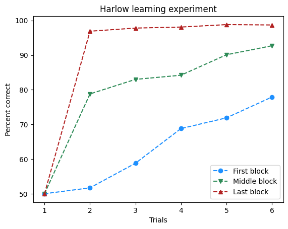
Exercise 6: Plotting with matplotlib#
The plot method has multiple other keyword arguments to control the appearance of
its results. For example, the color keyword argument controls the color of the lines.
One way to specify the color of each line is by using a string that is one of the named
colors specified in the Matplotlib documentation. Use this keyword argument to change the color of the lines in the plot.
trials = [1, 2, 3, 4, 5, 6]
first_block = [50, 51.7, 58.8, 68.8, 71.9, 77.9]
middle_block = [50, 78.8, 83, 84.2, 90.1, 92.7]
last_block = [50, 96.9, 97.8, 98.1, 98.8, 98.7]

fig, ax = plt.subplots()

ax.plot(trials, first_block, marker='o', linestyle='--', label="First block", color='dodgerblue')
ax.plot(trials, middle_block, marker='v', linestyle='--', label="Middle block", color='seagreen')
ax.plot(trials, last_block, marker='^', linestyle='--', label="Last block", color='firebrick')

ax.legend()
ax.set(xlabel='Trials', ylabel='Percent correct', title='Harlow learning experiment')

plt.show()
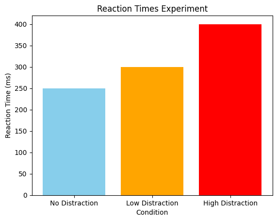
Exercise 7: Reaction time plotting#
Please create a bar plot for the results of a reaction time experiment. The figure should contain:
A single plot with three bars (one for each condition)
Colors: skyblue for no distraction, orange for low distraction, and red for high distraction
A title, an x-axis label, and an y-axis label
conditions = ['No Distraction', 'Low Distraction', 'High Distraction']
reaction_times = [250, 300, 400]

fig, ax = plt.subplots()
ax.bar(conditions, reaction_times, color=['skyblue', 'orange', 'red'])
ax.set(xlabel='Condition', ylabel='Reaction Time (ms)', title='Reaction Times Experiment')

plt.show()
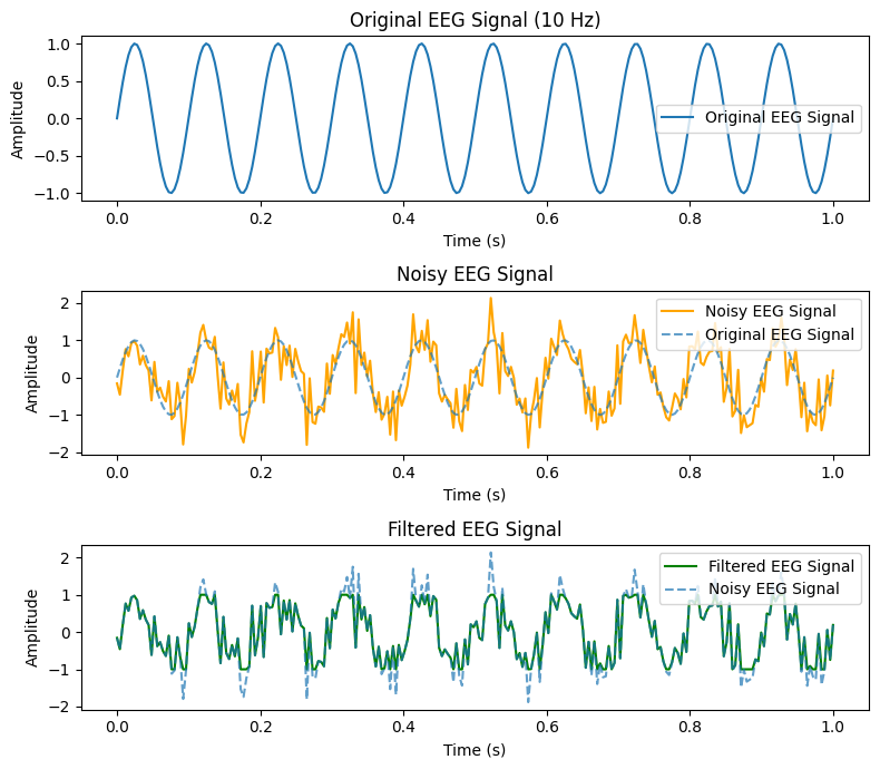
Exercise 8: EEG signal processing#
Please create a single figure, which contains three subplots containing artificial EEG signal. The subplots should be stacked below each other. All plots should contain labels and a legend.
EEG signal plotting:
Plot the artificial EEG signal using matplotlib.
Noise addition:
Add Gaussian noise (mean = 0, std = 0.5) to the EEG signal. Hint: You can use
np.random.normal()to add the noise.Plot the noisy EEG signal and compare it with the original signal.
Filtering:
Apply a simple threshold filter to remove values outside the range [-1, 1]. Hint: You can use
np.clip()for this.Plot the filtered signal.
# Parameters
sampling_rate = 250  # Sampling rate in Hz
time = np.linspace(0, 1, 250)  # Time vector 1 seconds duration, 250 samples (x-values of the plot)
frequency = 10  # "Alpha wave" frequency in Hz

# Generating the sine wave signal
eeg_signal = np.sin(2 * np.pi * frequency * time)

# 1. Plotting the signal
fig, axs = plt.subplots(3, 1, figsize=(8, 7))

axs[0].plot(time, eeg_signal, label='Original EEG Signal')
axs[0].set_title('Original EEG Signal (10 Hz)')
axs[0].set_xlabel('Time (s)')
axs[0].set_ylabel('Amplitude')
axs[0].legend()

# 2. Adding Gaussian noise
noise = np.random.normal(0, 0.5, eeg_signal.shape)
noisy_eeg_signal = eeg_signal + noise

axs[1].plot(time, noisy_eeg_signal, label='Noisy EEG Signal', color='orange')
axs[1].plot(time, eeg_signal, label='Original EEG Signal', linestyle='--', alpha=0.7)
axs[1].set_title('Noisy EEG Signal')
axs[1].set_xlabel('Time (s)')
axs[1].set_ylabel('Amplitude')
axs[1].legend()

# 3. Applying threshold filter
filtered_eeg_signal = np.clip(noisy_eeg_signal, -1, 1)

axs[2].plot(time, filtered_eeg_signal, label='Filtered EEG Signal', color='green')
axs[2].plot(time, noisy_eeg_signal, label='Noisy EEG Signal', linestyle='--', alpha=0.7)
axs[2].set_title('Filtered EEG Signal')
axs[2].set_xlabel('Time (s)')
axs[2].set_ylabel('Amplitude')
axs[2].legend()

plt.tight_layout()
plt.show()
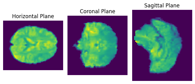
Exercise 9: Plotting an image#
The following example downloads fMRI data from the internet and averages it over time, so you arrive at a single 3D image of the brain with shape (61, 73, 61).
As images are usually 2-dimensional, we can visualize it by plotting the three aex separately.
Create three subplots.
Plot the brain in its three different planes (horizontal, coronal, saggital) by using matplotlib’s
imshow()function.
Hints: You can index the middle of the brain in each axis with e.g. averaged_fmri[averaged_fmri.shape[0] // 2, :, :] (// is a floor division operator which returns the largest integer less or equal than the result of the divison).
Important: If you use Google colab, you need to install the nilearn and nibabel packages by typing !pip install nilearn nibabel in a code cell before importing them.
from nilearn import datasets
import nibabel as nib

haxby_dataset = datasets.fetch_adhd(n_subjects=1) # Download the Haxby dataset
fmri_img = nib.load(haxby_dataset.func[0]) # Load the fMRI data using nibabel
fmri_data = fmri_img.get_fdata() # Convert to a 4D numpy array
print(f"Shape of the fMRI data: {fmri_data.shape}")
averaged_fmri = np.mean(fmri_data, axis=3) # Average over the time dimension to get a single image
print(f"Shape of the fMRI data (averaged over time): {averaged_fmri.shape}")

fig, ax = plt.subplots(1, 3)

ax[0].imshow(averaged_fmri[:, :, averaged_fmri.shape[2] // 2])
ax[0].set_title('Horizontal Plane')
ax[0].axis('off')

ax[1].imshow(averaged_fmri[:, averaged_fmri.shape[1] // 2, :])
ax[1].set_title('Coronal Plane')
ax[1].axis('off')

ax[2].imshow(averaged_fmri[averaged_fmri.shape[0] // 2, :, :])
ax[2].set_title('Sagittal Plane')
ax[2].axis('off')

plt.tight_layout()
plt.show()
Shape of the fMRI data: (61, 73, 61, 176)
Shape of the fMRI data (averaged over time): (61, 73, 61)
Voluntary Exercise 1: More NumPy indexing#
Generate a random 10x10 matrix with values between 10 and 99
Find the index of the largest value by using
np.where()and replace it with 0Find the row-wise and column-wise sums of the updated array and print the result.
# Voluntary exercise 1

# 1. Create matrix
matrix = np.random.randint(10, 99, size=(10, 10))
print(matrix)
print("\n")

# 2. Replace largest value
max_index = np.where(matrix == matrix.max())
matrix[max_index] = 0
print(matrix)

# 3. Calculate sums
row_sums = matrix.sum(axis=1)
column_sums = matrix.sum(axis=0)

print(f"\nRow-wise sums: {row_sums}")
print(f"Column-wise sums: {column_sums}")
[[67 26 24 68 56 96 35 67 37 58]
 [15 59 75 87 22 25 91 97 44 38]
 [15 35 59 74 88 11 40 20 45 82]
 [74 94 65 51 38 20 16 49 30 81]
 [61 74 63 16 34 69 96 75 66 74]
 [59 52 13 13 21 43 48 65 89 52]
 [94 62 35 90 13 72 98 56 41 73]
 [64 36 59 95 89 84 43 65 63 49]
 [12 80 17 14 86 74 20 71 55 67]
 [40 60 58 84 52 35 47 24 92 62]]


[[67 26 24 68 56 96 35 67 37 58]
 [15 59 75 87 22 25 91 97 44 38]
 [15 35 59 74 88 11 40 20 45 82]
 [74 94 65 51 38 20 16 49 30 81]
 [61 74 63 16 34 69 96 75 66 74]
 [59 52 13 13 21 43 48 65 89 52]
 [94 62 35 90 13 72  0 56 41 73]
 [64 36 59 95 89 84 43 65 63 49]
 [12 80 17 14 86 74 20 71 55 67]
 [40 60 58 84 52 35 47 24 92 62]]

Row-wise sums: [534 553 469 518 628 455 536 647 496 554]
Column-wise sums: [501 578 468 592 499 529 436 589 562 636]
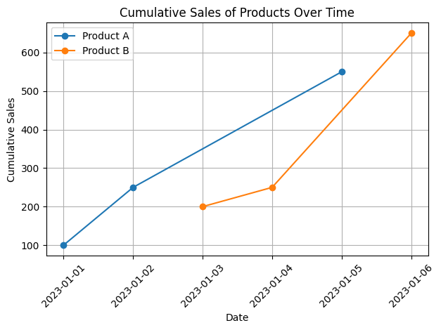
Voluntary exercise 2: More Pandas operations and plotting#
Given the DataFrame with columns “Product”, “Sales”, and “Date”:
Create a new column called
Cumulative_Saleshowing the cumulative sales by product over timePlot a line graph of cumulative sales for each product.
Hints:
DataFrames have a
.cumsum()method which you can useYou can loop over the unique products like so:
for product in df['Product'].unique():
df = pd.DataFrame({
    'Product': ['A', 'A', 'B', 'B', 'A', 'B'],
    'Sales': [100, 150, 200, 50, 300, 400],
    'Date': pd.date_range(start='2023-01-01', periods=6, freq='D')
})

# 1. Calculate cumulative sales
df['Cumulative_Sale'] = df.groupby('Product')['Sales'].cumsum()
print(df)

# 2. Plot cumulative sales
for product in df['Product'].unique():
    product_data = df[df['Product'] == product]
    plt.plot(product_data['Date'], product_data['Cumulative_Sale'], marker='o', label=f'Product {product}')

plt.xlabel('Date')
plt.ylabel('Cumulative Sales')
plt.title('Cumulative Sales of Products Over Time')
plt.xticks(rotation=45)
plt.legend()
plt.grid(True)
plt.tight_layout()
plt.show()
  Product  Sales       Date  Cumulative_Sale
0       A    100 2023-01-01              100
1       A    150 2023-01-02              250
2       B    200 2023-01-03              200
3       B     50 2023-01-04              250
4       A    300 2023-01-05              550
5       B    400 2023-01-06              650
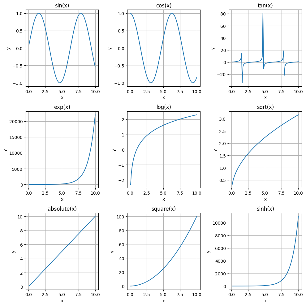
Voluntary exercise 3: Large plotting layouts#
Create a 3x3 grid of subplots
For each subplot, plot a different function (e.g., sin(x), cos(x), tan(x), etc.)
Customize the titles, axes, and tick labels of each subplot.
Hints:
Try to do the plotting in a single loop. The potential loop could look like this:
for ax, func in zip(axes.flat, functions):, withaxesbeing the axex object fromplt.subplotsandfunctionsbeing a list containing the relevant functionsYou can find a list of usable mathematical functions here
The name of the mathematical function can be accessed through the
func.__name_attribute
# Voluntary exercise 3

# 1. Create a 3x3 grid of subplots
fig, axes = plt.subplots(3, 3, figsize=(10, 10))

# 2. Select the different functions
functions = [np.sin, np.cos, np.tan, np.exp, np.log, np.sqrt, np.abs, np.square, np.sinh]
x = np.linspace(0.1, 10, 100)

# 3. Plot the functions and customize the plots
for ax, func in zip(axes.flat, functions):
    ax.plot(x, func(x))
    ax.set(xlabel='x', ylabel='y', title=f'{func.__name__}(x)')
    ax.grid(True)

plt.tight_layout()
plt.show()
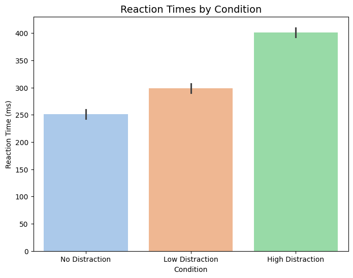
Voluntary exercise 4: Bar plot with seaborn#
Recall Exercise 7, which involved the plotting of a bar plot. The data is now extended to contain multiple measurements, which should be represented in the figure through errorbars.
Convert the data into a DataFrame and use this as input for the plotting function.
Create a barplot using
sns.barplot(). The plot should contain errorbars showing the standard deviation, a pastel color palette, labels, and a title.
import seaborn as sns

conditions = ['No Distraction', 'Low Distraction', 'High Distraction']
reaction_times = [
    [240, 250, 260, 255],  # No Distraction
    [290, 300, 310, 295],  # Low Distraction
    [390, 400, 410, 405]   # High Distraction
]

# Convert data to a DataFrame
data = []
for condition, times in zip(conditions, reaction_times):
    for time in times:
        data.append({"Condition": condition, "Reaction Time (ms)": time})

df = pd.DataFrame(data)

# Create the bar plot
plt.figure(figsize=(8, 6))
sns.barplot(x="Condition", y="Reaction Time (ms)", data=df, errorbar="sd", palette="pastel", hue="Condition")

plt.title('Reaction Times by Condition', fontsize=14)
plt.show()
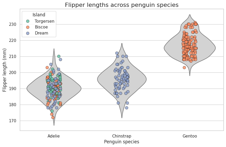
Voluntary exercise 5: Visualizing penguin flipper lengths across species and islands#
The Palmer Penguins dataset provides measurements for three penguin species: Adelie, Chinstrap, and Gentoo, across three islands. The dataset includes information about bill length, bill depth, flipper length, and body mass. In this exercise, you’ll create a violin plot to visualize the distributions of a chosen feature (e.g., flipper length) across species and islands.
Load the Palmer Penguins dataset from Seaborn. Remove rows with missing values.
Use Seaborn’s whitegrid theme
Create a violin plot to represent the distribution of flipper lengths for each penguin species. Use a neutral color (lightgray) for the violin plot background and remove internal lines.
Use a strip plot to overlay individual data points for each species. Color the points based on the island (island column). Spread the points with jitter to reduce overlap and improve visibility.
ustomize the points: Increase size for better visibility, add a black edge color and set a small edge width, and make the points semi-transparent (alpha=0.8) to handle overlapping.
Add a descriptive title. Label the x-axis as “Penguin Species” and the y-axis as “Flipper Length (mm)”.
Adjust the legend to make it clear which colors correspond to which islands. Place the legend in the upper left corner of the plot.
Ensure the figure size is appropriate (10x6 inches). Display the final plot.
Answer the following questions: On which island to penguins have the longest flipper length? Which penguins inhabitate which island?
# Load the penguins dataset
df = sns.load_dataset("penguins")

# Drop rows with missing data
df.dropna(subset=["species", "island", "flipper_length_mm"], inplace=True)

# Set seaborn style
sns.set_theme(style="whitegrid")

# Create the figure
plt.figure(figsize=(10, 6))

# Full violin plot for flipper lengths
sns.violinplot(
    x="species",
    y="flipper_length_mm",
    data=df,
    inner=None,
    linewidth=1.5,
    color="lightgray"
)

# Overlay scatter plot points colored by island
sns.stripplot(
    x="species",
    y="flipper_length_mm",
    hue="island",
    data=df,
    palette="Set2",
    jitter=True,
    alpha=0.8,
    size=8,
    edgecolor="black",
    linewidth=0.5
)

# Add titles and labels
plt.title("Flipper lengths across penguin species", fontsize=16)
plt.ylabel("Flipper length (mm)", fontsize=12)
plt.xlabel("Penguin species", fontsize=12)

# Adjust legend
plt.legend(title="Island", loc="upper left")
plt.show()